Jamis Diablo":22sw7xa4 said:
I really like the paint scheme, but I would have reversed the coulours.
Now it is more black than white, but that is a matter of taste.
Pink decals would like the Etto would look great.
You started your story with wich paint job would show the brazing best, but with this scheme it is not very visable, is it?
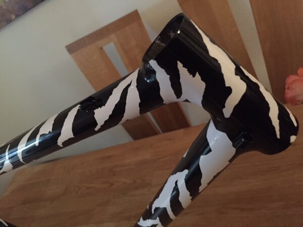
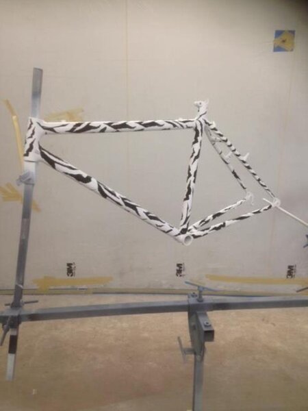
The pics of the frame so far, are off the first stage of paint.
Because the bikes predominant colour is white, I needed to paint first in black. all you are seeing in the pics so far, are the decal stencils placed/stuck on to the frame to see if decal placement was right prior to the next stage of paint, this being the white.
Believe me, it wasn't easy trying to think it through in reverse.
(if you look close you can see some of the air bubbles I have to contend with before painting, isn't a massive worry as these decals will need to be removed after all the white coat has been applied)