Ti Raleigh Seat Tube Decals.. The Definitive Guide To The Correct Team Livery

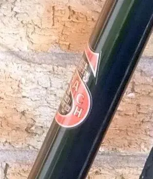
This issue also effected the old incorrect versions, what you see on the right is my mock up to show off what has been achieved regarding the incorrect font, there's no lacquer as explained at the beginning of this thread..how decals are printed etc is a separate issue. Contact Steve directly at Lloyds and he will be able to help with your concerns and give you a better explanation.
 
Last edited:
Hi, in no way am I criticizing the excellent work that you've done correcting the font.
My thoughts were that if the font was such a big issue and an immediate identifier that a frame was not in it's original livery, then perhaps the method of manufacturing also needs addressing.
As I pointed out in a previous post, this is not exclusive to the Raleigh decal and is typical of black edged decals being applied on a black paint scheme.
 

Attachments

  • selbach decal.jpg
    selbach decal.jpg
    25.1 KB · Views: 6
Thank you for your positive feedback.. very much appreciated.👍
The way decals are printed I guess as with everything else has evolved with the original decals being varnish fix. The problems with these was the black outline was printed over the base colour with nothing to stop the background (frame) colours from bleeding through. With the yellow Team on the red top tube would show as more orange, the yellow over the black seat tube less vibrant, the issue getting worse over time as the pigments fade. I guess that printing on vinyl stops this bleeding fading but a thicker decal is the payoff. Maybe you could request your desired decal to be printed onto a thinner backing though it may not be quite as resilient.

20210907_114350~2.jpg
 
At the beginning of this thread i explained that the incorrect Ti Raleigh Team seat tube decals had been replicated using an incorrect more upright font as seen on the later Panasonic Team Livery and other later Raleigh models...in this montage we can take a closer look at the similarities...🔎

First up on the left is the original Team Panasonic seat tube decal that appeared in 1984 and was seen on the Team Bikes and other team replica models such as the Cadet. The font is the same as that used on the down tube decals this also applies to the original Ti Raleigh Team Livery... the seat and down tube font is the same.

In the middle is the later Team Panasonic seat tube decal that appeared later in 84/85... the change can now be easily spotted, the font has been turned a few degrees anticlockwise to make it more upright...why the change you all ask?... this is something that I will explain later..

And finally...a very dodgy looking imposter, the INCORRECT Raleigh seat tube decal that's been around for well over ten years. Apart from the adjustment to the letter R the similarities between the later Team Panasonic version in the middle with it's upright font can be easily spotted...

ZomboDroid 25012022094447~2.jpg
 
Now a full line up of all the suspect's for comparison..

1. Early Team Panasonic

2. Later Team Panasonic with its upright font

3. The dodgy looking imposter

4. Genuine original 1974 Ti Team Raleigh (thicker black center line and no black outline)

5. The correct seat tube decal from H Lloyd Cycles (based on the more refined original from 1980)

We can now clearly see that the only thing the incorrect version has has in common with the original is that it's yellow and black.. everything else about it is COMPLETELY WRONG..!

ZomboDroid 25012022094447.jpg
 
Last edited:
& im having my SBDU 753 frame corrected with the new seat tube decal thanks to vcballbat 👍
Cheers Nob🍺 I'm really happy that it's being sorted, makes all the work torqueless and I put into it worthwhile... looking forward to seeing her built up..any clues on the spec?
 
  • Like
Reactions: Nob
Cheers Nob🍺 I'm really happy that it's being sorted, makes all the work torqueless and I put into it worthwhile... looking forward to seeing her built up..any clues on the spec?
Once in my possession this may not be built up for along time due to other things taking priority but I’m thankful for the help you’ve provided 👍
 
I've mentioned that Raleigh never used a more upright font in Ti Team Raleigh Livery.. this isn't actually quite true 😱... It did actually appear on the very first Team Livery with the yellow painted head tube as seen on very early Raleigh Europa's, the font used was different with more rounded letters.. it's very rare to find any that survive in original paint..😞

team_raleigh_europa_racing_bike_100_ono_tel_or_text_07943575702_6421401.jpg team_raleigh_europa_racing_bike_100_ono_tel_or_text_07943575702_6421403.jpg team_raleigh_europa_racing_bike_100_ono_tel_or_text_07943575702_6421403~2.jpg
 
It also made a breif appearance on the Raleigh Team Professional... again increadably rare to find an original survivor and sadly this one has been lost forever to a very dodgy looking incorrect upright version...such a shame..😢

raleigh-reno-ed.jpg raleigh-reno-ed~2.jpg team-raleigh-reno-ed.jpg
 
Back
Top