how do i set up my own web page and how do i make a logo?

FluffyChicken":18jyz7g5 said:
Of course you can have it. Though either get somebody to do the wheel properly or I'll have a go doing it accurately.
If that style of wheel is fine (tried to get at least some sort of 'crossing' of the spoke)

cheers mate that sort of wheel is perfect was thinking a double tri spoke cool 8) :D :D
 
Hi, I love that you are building wheels for the love and craft of what you do, not enough skill or enough appreciation of it these days.

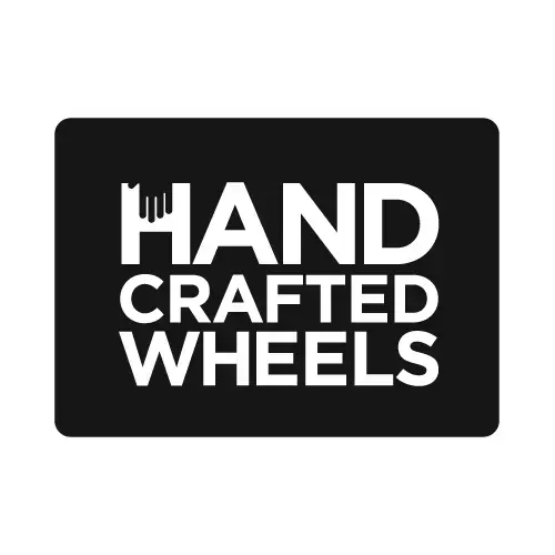
I have to be brutally honest though, I don't like the logo/graphics :(

Sorry.

I think beautifully crafted wheels deserve much better. :D

I would urge you to think hard about what you want the logo to convey before hitting to paintshop pro or whatever. Try sketching it first perhaps. Also have a look at other good, relevant logos. I think this is a great example of what you should be aiming for: http://www.candycranks.com/

Things to consider IMHO:
1. Free typefaces are about a good as free bikes: you get the occasional gem, but most are pretty rubbish.
2. A representation of a wheel is really difficult to draw and reproduce. Do you need one? (McDonalds don't use a picture of a burger for their logo)
3. Try to come up with an 'idea' that you use to design the logo around.

Logo design is not easy at all, I know I do it for a living :D

If you like I'll see if I can put some ideas together one lunchtime?
 
PS. I would recommend trying wordpress to create your website. It's a blogging platform, but is far more powerful than that.
 
:lol: I don't like that Candy Cranks logo

Not saying I particularly like the wheel I did, it was more for and idea of layout.
 
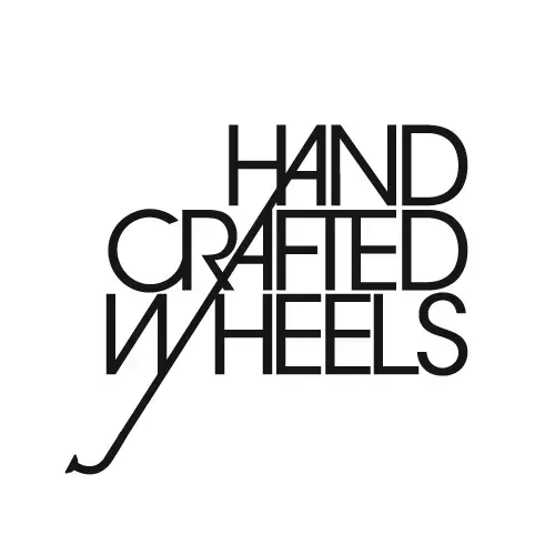
Here's a couple of ideas I threw together while munching my sarnies:

What do you think? Just initial ideas, need thinking through properly...
 

Attachments

  • handcraftedwheels1.webp
    handcraftedwheels1.webp
    5 KB · Views: 526
  • handcraftedwheels2.webp
    handcraftedwheels2.webp
    8.6 KB · Views: 526
  • handcraftedwheels3.webp
    handcraftedwheels3.webp
    5.9 KB · Views: 526
REKIBorter":3itiy2hb said:
^^^ the mans got talent ^^^ I like the spoke one 8)


im loving the spoke one too that fits perfectly with my ideas of good old fashion craftmanship brian you have some brilliant talent there its wow wow wow :shock: :shock: :shock: :shock: i really really like it i lot sorry fluffy :oops: how did you do it brian its proper perfect :D :shock: :D :D :D
 

Attachments

  • handcraftedwheels3_115.webp
    handcraftedwheels3_115.webp
    5.9 KB · Views: 484
Don't be sorry. Use the one you like I was just popping out other idea's as I didn't like the original background but basing them on yours.

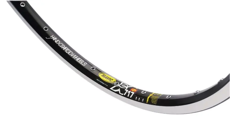
Though you would need to transfer that design into a Rim sticker that. I don't think it'll work as the 3 line job as it would be too tall yet not long enough for that traditional sticker look.

The spoke one is the one I prefer, I've seen the last one before somewhere (or at least that design)

Though I know you're a DT spoke builder, I think you give the Wheelsmith impression better over DT's
http://www.wheelsmith.com/
http://www.dtswiss.com/Products/Components/Spokes.aspx
 
I was going to throw something in too - until I saw Bryan's spoke design, it is perfect for your ethos and really conveys a traditional approach - even makes it look like your company has been around for a while.

- real talent Bryan and you are right logo design is one of the hardest going.
 
cannondale king":2x78t9aa said:
REKIBorter":2x78t9aa said:
^^^ the mans got talent ^^^ I like the spoke one 8)


im loving the spoke one too that fits perfectly with my ideas of good old fashion craftmanship brian you have some brilliant talent there its wow wow wow :shock: :shock: :shock: :shock: i really really like it i lot sorry fluffy :oops: how did you do it brian its proper perfect :D :shock: :D :D :D

:oops: :oops: :)
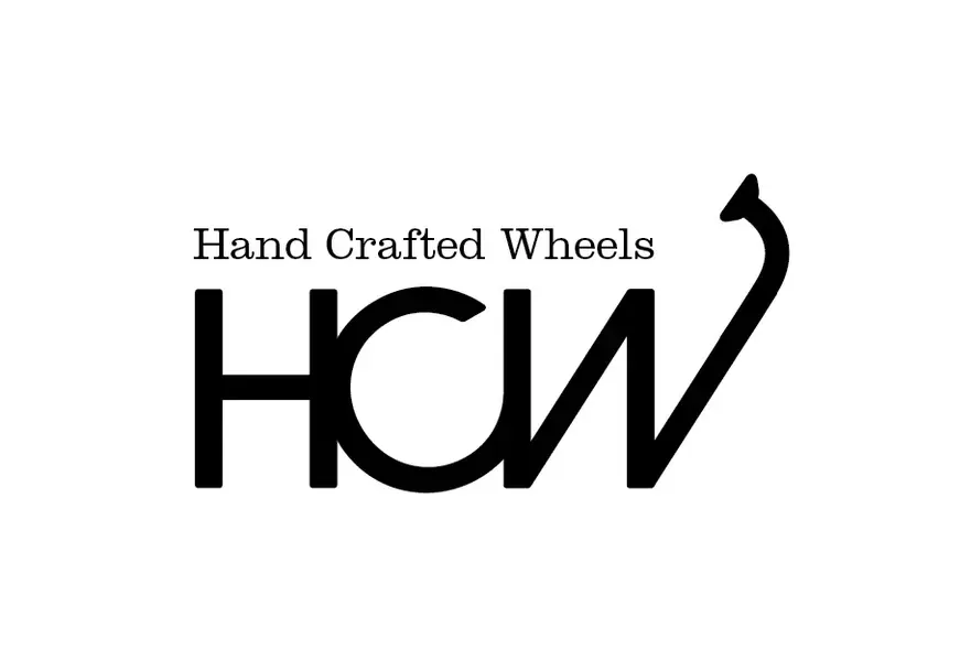
It's far from perfect! It does need some thinking about and refining, but I think the idea is good, and the customised Avant Garde type gives the right modern classic feel. I think it could perhaps be a bit bolder, and there would need to be ar-arranged cut of the logo that is long.

The length of the name is a slight problem. It may be worth considering HCW for the logo (at lease for some applications). Though if you're smart you can use the length to your advantage :D
 

Attachments

  • Screen shot 2010-11-23 at 14.19.57.webp
    Screen shot 2010-11-23 at 14.19.57.webp
    11.2 KB · Views: 455
  • rimshot.webp
    rimshot.webp
    18.3 KB · Views: 455
Back
Top