Reynolds 531 decal information required!

Stormylolol

Devout Dirtbag
Hi all,

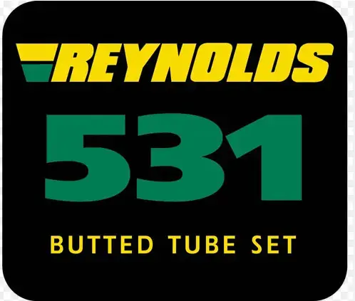
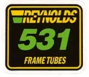
I am looking for information on this specific Reynolds 531 sticker - more specifically what sort of tubing is it (straight gague vs double butted), and a possible date for years of manufacture?

Unless I have made a booboo, it does not appear on the Reynolds 531 sticker timeline on the H Lloyd website. In my experience I have only seen this decal on Mercian frames (and also maybe Dawes??) and in general not that commonly either.

Many thanks

1751011552960.webp
 
https://www.reynoldstechnology.biz/wp-content/uploads/2015/10/decal_history.pdf

Its just shown as '1995 onwards'. 531 was giving way to 631 and what with the uptick in alu framed bikes late 90s these stickers are less populous. I dont think they would be restricted to certain marques, more that new 531 framed bikes after the 90s were much rarer than the previous 5 odd decades.
True, and I suppose with a frame maker like Mercian it would make sense to see more of their frames with them as they are (at least from what I know) still very much focused on steel frames and always have been. Now that I think about it, it is the same for Dawes tourers which again makes sense.

Its a shame the link does not specify whether the stickers refer to single or double butted. I have noticed quite the difference in weight between my 531c and 531ST frames
 
What is striking is how bad it is as a sticker compared to most of the Reynolds stock: no information on the tubeset, poor layout and font - lazy and a guarantee of not much. I guess enshitification was always a thing.
 
What is striking is how bad it is as a sticker compared to most of the Reynolds stock: no information on the tubeset, poor layout and font - lazy and a guarantee of not much. I guess enshitification was always a thing.
Yeah that all rings true when actually sitting to think about it. I quite like that original 735 with the purple on it - colourful, informative, legible, and fun - it does everything 😁

Downhill seems to be the trend for most logos these days
 
What is striking is how bad it is as a sticker compared to most of the Reynolds stock: no information on the tubeset, poor layout and font - lazy and a guarantee of not much. I guess enshitification was always a thing.
The rot is setting in from 1989.
1751066362349.webp
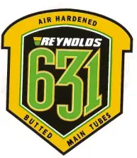
The dropped the gold for yellow and thats always going to make you look like a cheapo, demeaning the product along the way. And then theres the woeful 631/853 logos.
1751066552228.webp
...which look like beer mats. The whole tone of this logo is retrogressive, invoking the past. Real ale, steam trains, canals and narrowboats, yesterday. They're dropping the pretence this is a cutting edge product and instead pointing to the past glories of steel.

Columbus always did good tubing stickers, even when the tubes themselves were low end.
 
Yeah that all rings true when actually sitting to think about it. I quite like that original 735 with the purple on it - colourful, informative, legible, and fun - it does everything 😁

Downhill seems to be the trend for most logos these days
To the young me, who started racing in 1981 here in Ireland, a glimpse from a distance of that 753 decal was just out of this world, only seen in magazines. The first one I actually saw for real belonged to Debbie Kane, a teenager at the time, who was even then the top woman on the island. Hers was in the Raleigh team colours. Her dad was Dave Kane, who had the famous bike shop in Belfast. Still open today.
 
Last edited:
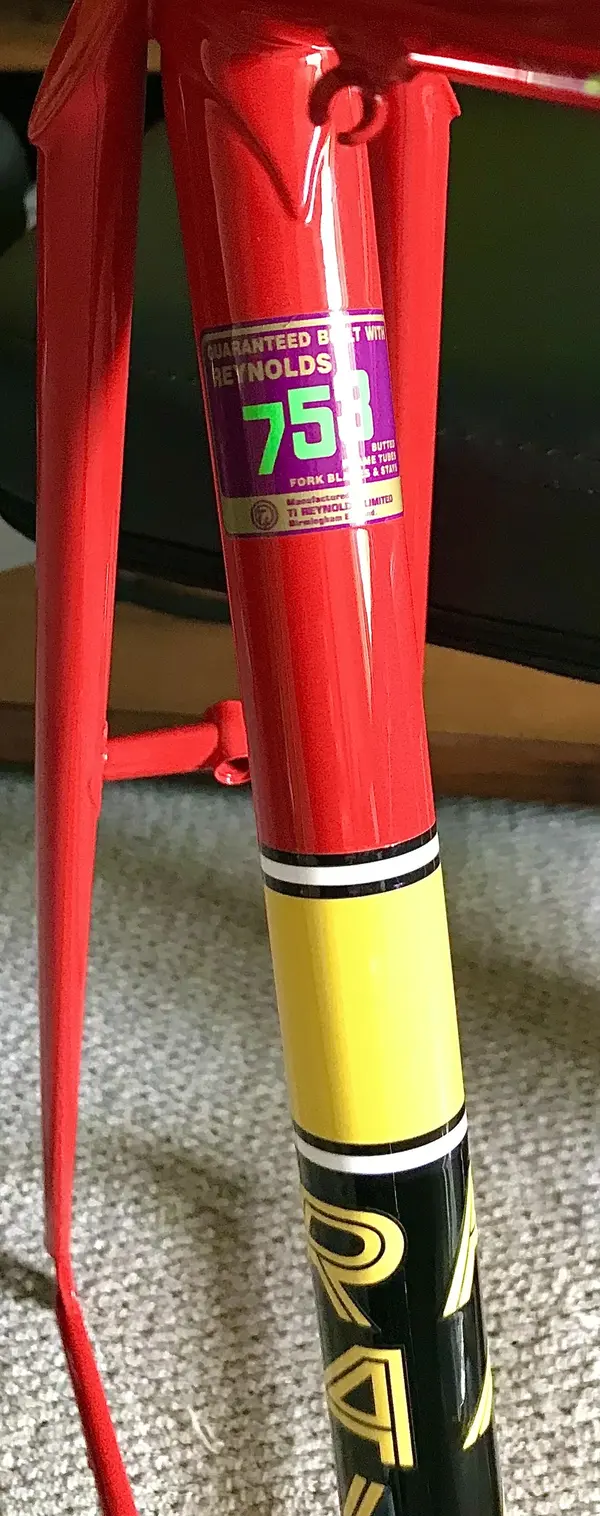
The TI era ones are great, with writing and guarantees and psi figures: and when you see the red of 531 pro or the pink of 753 it’s a moment.

Coolest one I had:

IMG_1121.webp
 
Back
Top