S1m0nR
Old School Hero
Hello folks,
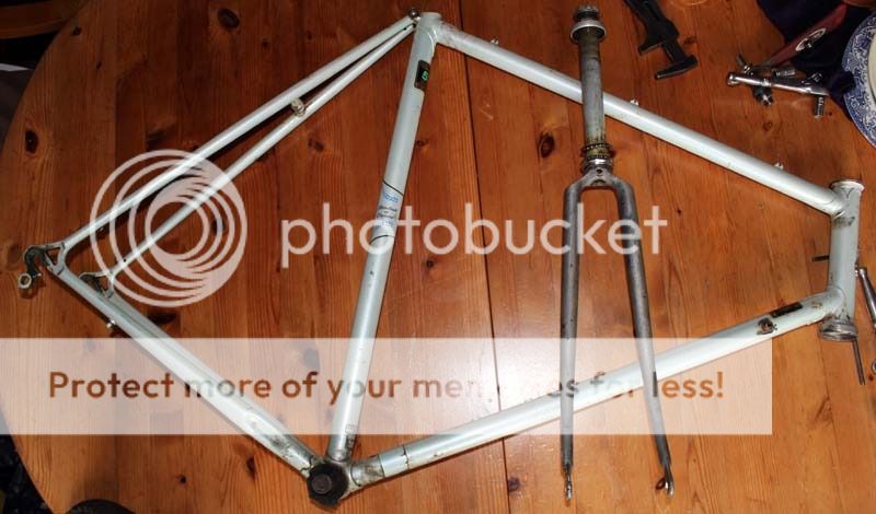
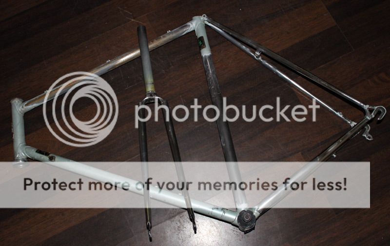
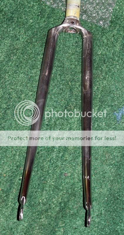
I rescued a Raleigh Road Ace 531c frame from the local recycling centre and I'm going to use it to build a fixie. At least for a while anyway, it'll probably be rebuilt to original spec one day as and when I get bored of the fixed gear life and time/component availablility allows.
I've always liked the Gulf colours (as per classic GT40s and the current Aston Martin Le Mans cars) so I'm going to refinish the frame with those. A couple of reproduced Raleigh decals will finish it off nicely.
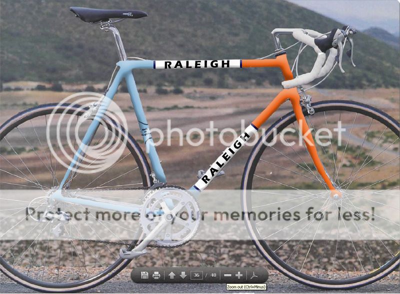
Does anyone have any opinions about the options below? I'm erring towards Option 3 as it's Gulf colours but also in the style of the specialist Raleigh frames of the 1980's- sort of a nod in both directions.
I think it could look very smart indeed....
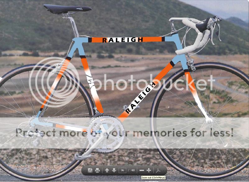
Design 1:
Design 2:
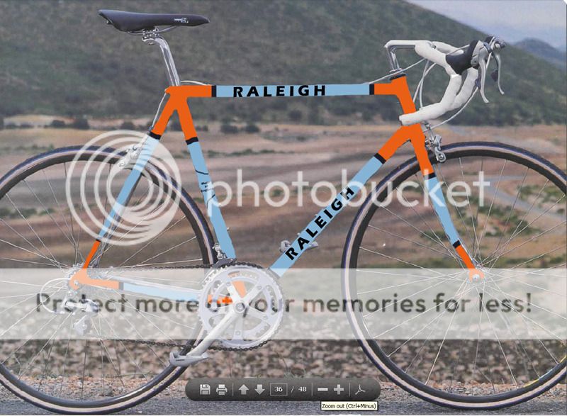
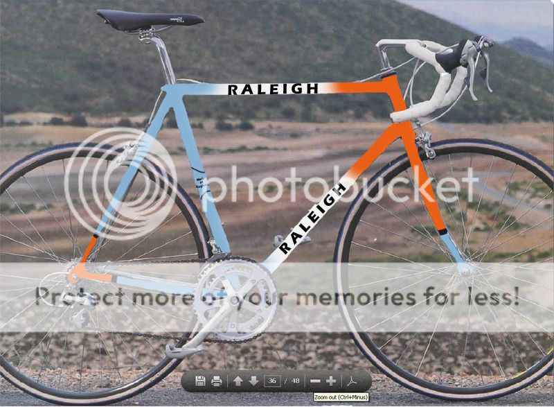
Design 3:
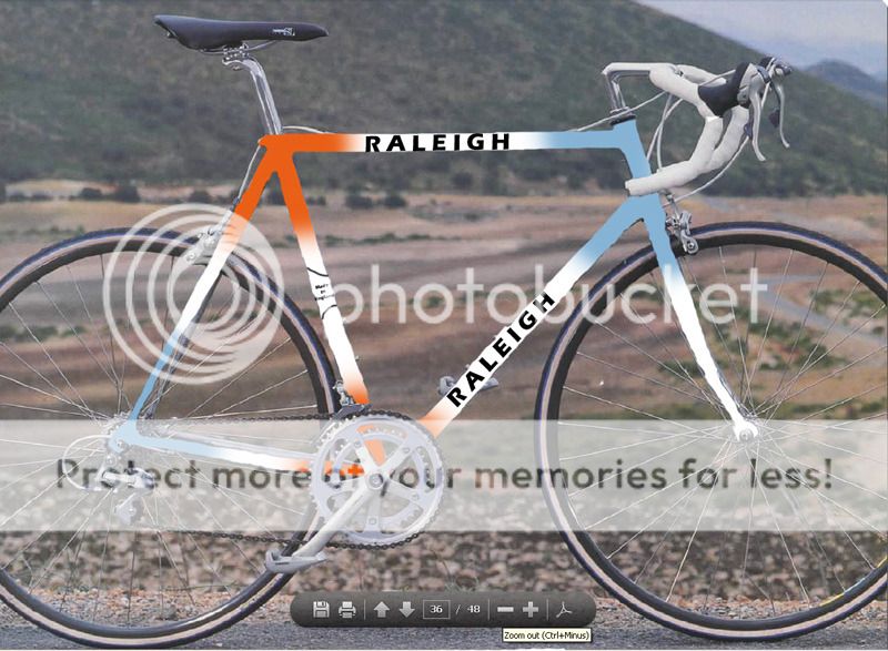
Design 4:
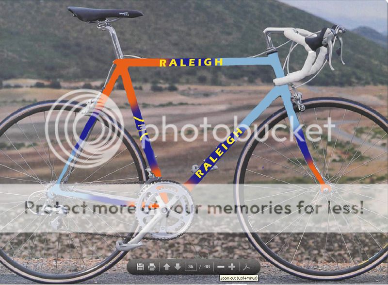
Design 5
Cheers...
I rescued a Raleigh Road Ace 531c frame from the local recycling centre and I'm going to use it to build a fixie. At least for a while anyway, it'll probably be rebuilt to original spec one day as and when I get bored of the fixed gear life and time/component availablility allows.
I've always liked the Gulf colours (as per classic GT40s and the current Aston Martin Le Mans cars) so I'm going to refinish the frame with those. A couple of reproduced Raleigh decals will finish it off nicely.
Does anyone have any opinions about the options below? I'm erring towards Option 3 as it's Gulf colours but also in the style of the specialist Raleigh frames of the 1980's- sort of a nod in both directions.
I think it could look very smart indeed....
Design 1:
Design 2:
Design 3:
Design 4:
Design 5
Cheers...
")