RockiMtn Gold Trader Rocky Mountain Fan Feedback View May 17, 2011 #23 lovely frame/fork… but those COLOURS… ouch! :shock: That clashing is definitely not my cup of tea. kikaha… is that yours?
lovely frame/fork… but those COLOURS… ouch! :shock: That clashing is definitely not my cup of tea. kikaha… is that yours?
bagpipes Old School Hero May 17, 2011 #24 not as bad as that Purple and Mustard Hammer I had a few years back. (I've read this over several times and there is no better way to word it)
not as bad as that Purple and Mustard Hammer I had a few years back. (I've read this over several times and there is no better way to word it)
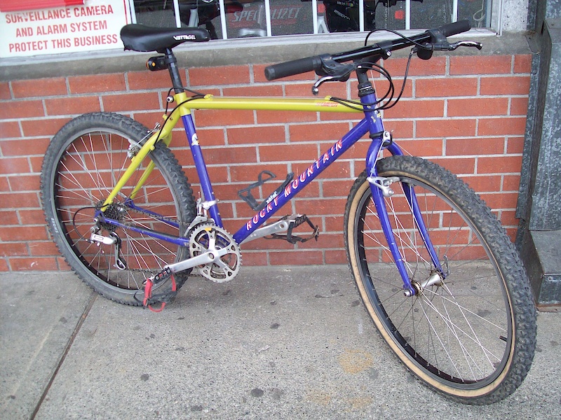
RockiMtn Gold Trader Rocky Mountain Fan Feedback View May 17, 2011 #25 you mean like this? i actually prefer this, as opposed to the colour of red/purple combo. the background on the pic doesn't help either though.
you mean like this? i actually prefer this, as opposed to the colour of red/purple combo. the background on the pic doesn't help either though.
kikaha PoTM Winner May 17, 2011 #27 RockiMtn":2lua1wv4 said: l kikaha… is that yours? Click to expand... no. the owner is a german rm freak. here his siite: http://www.retrorocky.de/40555.html
RockiMtn":2lua1wv4 said: l kikaha… is that yours? Click to expand... no. the owner is a german rm freak. here his siite: http://www.retrorocky.de/40555.html
bagpipes Old School Hero May 17, 2011 #28 RockiMtn":qgukvp51 said: you mean like this? i actually prefer this, as opposed to the colour of red/purple combo. the background on the pic doesn't help either though. Click to expand... That's the one. That yellow is like a muddy curry colour. It's absolutely gross; and the purple is as flat as Donald Trump's hair piece.
RockiMtn":qgukvp51 said: you mean like this? i actually prefer this, as opposed to the colour of red/purple combo. the background on the pic doesn't help either though. Click to expand... That's the one. That yellow is like a muddy curry colour. It's absolutely gross; and the purple is as flat as Donald Trump's hair piece.
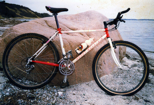
RockiMtn Gold Trader Rocky Mountain Fan Feedback View May 17, 2011 #30 Now that i LIKE!!! Red and White, perfect colours for a Canadian Tantalus! But gawd that's a piss poor photo/scan. I couldn't just leave it alone and had to do some quick colour correcting on it. Attachments RM_Tantalus.jpg 194 KB · Views: 1,575
Now that i LIKE!!! Red and White, perfect colours for a Canadian Tantalus! But gawd that's a piss poor photo/scan. I couldn't just leave it alone and had to do some quick colour correcting on it.