NEW TI RALEIGH 753 40TH TDF ANNIVERSARY MODEL v.2

Re: Re:

torqueless":2ku4yu0d said:
On the bike/frame itself I can see the decal issue (I didn't I must admit until it was pointed out) but now I can't unsee it although I do still think that it's a bit of a side issue compared to the quality of the bike itself.


That all goes for me too, Allen. But I'm going to carry on sounding off about this seat tube decal. Because it is a bit of a weird situation.

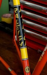
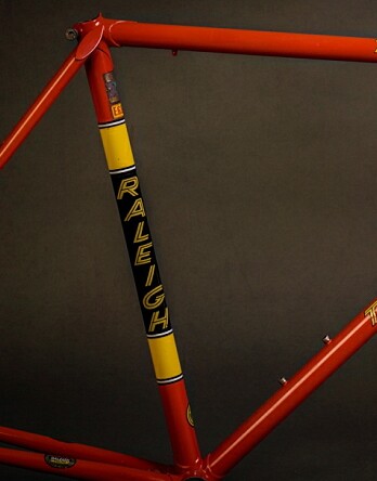
On the face of it, as far as I can extrapolate, we have an 'original' transfer that probably was originally designed by simply separating the letters of the down tube transfer and stacking them. Then we have a 'reproduction' transfer that presumably started out the same way, but then somewhere along the design process somebody decided that the letters should lose some degrees of italicisation, either for reasons of aesthetics, or legibility.

The fact that this tinkering seems to have passed beneath the notice (or in many cases, the care) of apparently devoted Raleigh-philes, including one with a fifty-odd collection who has meticulously catalogued the 'authentic' format, dimensions and frame position of every little transfer you would expect on a SBDU frame, perhaps bears testament to the quality and subtlety of this re-design.

These re-designed seat tube transfers seem to emanate from a well respected transfer supplier who are, in their small way, in the small world of racing bike enthusiasts, just as much of a venerable institution as Raleigh, and seem to supply their transfers to most of the well respected professional re-finishers of bicycle frames.

The fact that an alternative seat tube transfer with one letter returned to it's original degree of italicisation has apparently become available from some source suggests that at some point in forty-odd years someone has made some noise about the disparity between the existing reproduction transfer and the original, and someone has made a half-hearted attempt to humour them.

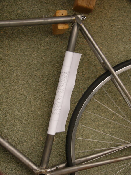
At any rate, I flatter myself that I have done most of what a bod can do with pencil and paper towards offering an 'alternative' seat tube transfer that will not offend the sensibilities of anybody who can not in good conscience apply or consent to the application of the existing reproduction transfers to the seat tube of a bicycle frame. The letters are 20mm high, each seperated by 3mm. From the top of the 'R' to the bottom of the 'H' thus measures nominally 158mm, and the panel in which the letters are placed measures 195mm. These two measures, perhaps coincidentally, correspond to the diameters of 42 and 52 tooth chainrings, minus the teeth themselves.

Any constructive feedback welcome:

I think you have done an excellent job and gone into great detail. As I have said earlier I have been in contact with the decal supplier who are now aware of this and are looking into the issue and this is just three decals out of their excellent high quality range. I will contact them again this week.
 
vcballbat":2lgwacg1 said:
A Raleigh Team Professional was on top of my Christmas list for 1980 :xmas-big-grin: ...I was very disappointed when Santa didn't bring me one.. :cry: .. and got Subbutio instead.. :cry: ...I hate football. Mum said Santa couldn't get the Raleigh down the chimney..I knew she was lying cos we lived in a tower block..:roll:
Move on 40 years a I've finally got one.. :D ... but it's in the wrong bloody colour.. :?
Still it's lighter than the new Ti 40 at 2000g for frame and 600g for the fork.. so like many are asking why is the 753 so heavy.. :?:
The Black and Yellow looks like the Raleigh Banana colours (minus the decals).
That's the colour scheme I'd go for if I had the chance.
 
vcballbat":34u9pusv said:
A Raleigh Team Professional was on top of my Christmas list for 1980 :xmas-big-grin: ...I was very disappointed when Santa didn't bring me one.. :cry: .. and got Subbutio instead.. :cry: ...I hate football. Mum said Santa couldn't get the Raleigh down the chimney..I knew she was lying cos we lived in a tower block..:roll:
Move on 40 years a I've finally got one.. :D ... but it's in the wrong bloody colour.. :?
Still it's lighter than the new Ti 40 at 2000g for frame and 600g for the fork.. so like many are asking why is the 753 so heavy.. :?:

I wanted one of these that year but sadly not to be :(

Space-Invaders.jpg
 
Re:

I think you have done an excellent job and gone into great detail. As I have said earlier I have been in contact with the decal supplier who are now aware of this and are looking into the issue and this is just three decals out of their excellent high quality range. I will contact them again this week.
Thanks vcballbat. Consider my drawing as reproduced here to be 'open source', or whatever the jargon is. I can post the original (pencil drawing) via 'snail' mail if it helps anyone. I cannot vouch for it's accuracy in comparison to an 'original' transfer. I was working on pretty scant dimensional information, mainly extrapolated from photos on these threads.
 
VCB Nice continuation of the "self ef-faeces-ing" theme.

I can see why you want to refinish that frame. I'm stuck with a couple of bikes with original fade paint, IMO it's never looked good.

Seeing as I can't find a "retrocooker " site I will go further off thread and say that cooker looks very nice.

My 54cm "Raleigh 531c race" frame is 1830g and forks 734g.

I'd like to know what the weight of a modern welded steel frame might be if the latest alloys and techniques were used. Would it still be heavier than 753 or could it be lighter and stronger?

I'm very interested in how you make new decals and also would like to know how the old ones were made. Were they screenprinted onto waterslide material? Colourfastness is a worry, if you laquer over reproduction decals and they fade it'll be a real headache.


Now we're all playing so nicely, perhaps Dame Dyer will give us goody bags to take home.
I just fancy getting a Cadbury's Curly Wurly in mine.

"What's that you say? "

Crowd "it's not really Cadbury's!"

Me "oh yes it is!, it says so on the wrapper"

Crowd "oh no it isn't!, it's made by a big company called Mondelez and they are smaller than they used to be and the geometry of the toffee is all wrong and they've changed the recipe of the chocolate and the spacing of the lettering on the wrapper is different"

Me "Oh dear, here we go again......"
 
steampowered":1f3evsbe said:
VCB Nice continuation of the "self ef-faeces-ing" theme.

I can see why you want to refinish that frame. I'm stuck with a couple of bikes with original fade paint, IMO it's never looked good.

Seeing as I can't find a "retrocooker " site I will go further off thread and say that cooker looks very nice.

My 54cm "Raleigh 531c race" frame is 1830g and forks 734g.

I'd like to know what the weight of a modern welded steel frame might be if the latest alloys and techniques were used. Would it still be heavier than 753 or could it be lighter and stronger?

I'm very interested in how you make new decals and also would like to know how the old ones were made. Were they screenprinted onto waterslide material? Colourfastness is a worry, if you laquer over reproduction decals and they fade it'll be a real headache.


Now we're all playing so nicely, perhaps Dame Dyer will give us goody bags to take home.
I just fancy getting a Cadbury's Curly Wurly in mine.

"What's that you say? "

Crowd "it's not really Cadbury's!"

Me "oh yes it is!, it says so on the wrapper"

Crowd "oh no it isn't!, it's made by a big company called Mondelez and they are smaller than they used to be and the geometry of the toffee is all wrong and they've changed the recipe of the chocolate and the spacing of the lettering on the wrapper is different"

Me "Oh dear, here we go again......"

Sorry forgot to mention that mine is 531db and it was repainted in Banana livery so is just overspray that was covered by bands. It was repainted well though I have removed the decals and the two pin headbadge to reveal three holes behind it. This proves it is a Raleigh Professional and not a Carlton Pro though they are identical frames apart from paint and headbadge. Its not an SB frame...number starts WB 9 which dates it to 1979.. frame is basically the same as a 76 ish SBDU Team frame. My other frame is a 82 SBDU 753 Dynaflite Aero with more information about it here..viewtopic.php?f=23&t=410688.
My old cooker is a 1950's New World 'Radiation' similar to the big range cookers you see in American movies..I bought it 25 years ago from the original owner who was having a new kitchen fitted. It still I full working order....I can post a full picture if I'm allowed.. :?: anyway I'm glad you like it... :D

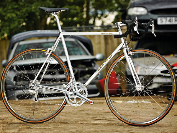
If I was going to get a lighter steel frame for maybe a little more money than the Ti 40 then I would go for one of these beauties..http://www.cherubim.jp/bikes/
https://cyclingtips.com/2018/08/bikes-o ... -cherubim/
 

Attachments

  • 1315906165773-ij9n8htj8301-7fd049b.jpg
    1315906165773-ij9n8htj8301-7fd049b.jpg
    112.6 KB · Views: 182
Re: Re:

torqueless":2btl7ffp said:
On the bike/frame itself I can see the decal issue (I didn't I must admit until it was pointed out) but now I can't unsee it although I do still think that it's a bit of a side issue compared to the quality of the bike itself.


That all goes for me too, Allen. But I'm going to carry on sounding off about this seat tube decal. Because it is a bit of a weird situation.

On the face of it, as far as I can extrapolate, we have an 'original' transfer that probably was originally designed by simply separating the letters of the down tube transfer and stacking them. Then we have a 'reproduction' transfer that presumably started out the same way, but then somewhere along the design process somebody decided that the letters should lose some degrees of italicisation, either for reasons of aesthetics, or legibility.

The fact that this tinkering seems to have passed beneath the notice (or in many cases, the care) of apparently devoted Raleigh-philes, including one with a fifty-odd collection who has meticulously catalogued the 'authentic' format, dimensions and frame position of every little transfer you would expect on a SBDU frame, perhaps bears testament to the quality and subtlety of this re-design.

These re-designed seat tube transfers seem to emanate from a well respected transfer supplier who are, in their small way, in the small world of racing bike enthusiasts, just as much of a venerable institution as Raleigh, and seem to supply their transfers to most of the well respected professional re-finishers of bicycle frames.

The fact that an alternative seat tube transfer with one letter returned to it's original degree of italicisation has apparently become available from some source suggests that at some point in forty-odd years someone has made some noise about the disparity between the existing reproduction transfer and the original, and someone has made a half-hearted attempt to humour them.

At any rate, I flatter myself that I have done most of what a bod can do with pencil and paper towards offering an 'alternative' seat tube transfer that will not offend the sensibilities of anybody who can not in good conscience apply or consent to the application of the existing reproduction transfers to the seat tube of a bicycle frame. The letters are 20mm high, each seperated by 3mm. From the top of the 'R' to the bottom of the 'H' thus measures nominally 158mm, and the panel in which the letters are placed measures 195mm. These two measures, perhaps coincidentally, correspond to the diameters of 42 and 52 tooth chainrings, minus the teeth themselves.

Edit: Since this picture was taken I have looked at a few more bikes, and as a consequence I have leaned the 'A' a little further to the right, making the right edge of the 'A' vertical- ie at 90degrees to the base of the letter.

Any constructive feedback welcome:

This picture from a different angle with the glare giving a centre line on the tube... thanks for your time and effort to provide us with something that looks correct... :xmas-big-grin:
 

Attachments

  • sb3505-1980-sbdu-ilkeston-ti-raleigh-team-pro-reynolds-753-frame-and-forks~3.jpg
    sb3505-1980-sbdu-ilkeston-ti-raleigh-team-pro-reynolds-753-frame-and-forks~3.jpg
    14.7 KB · Views: 165
  • sb3505-1980-sbdu-ilkeston-reynolds-753-ti-raleigh-team-pro-studio-frame-and-fork~2.jpg
    sb3505-1980-sbdu-ilkeston-reynolds-753-ti-raleigh-team-pro-studio-frame-and-fork~2.jpg
    27.3 KB · Views: 165
Re:

Looking at those, I reckon I need to move the middle stroke of my 'R' up a fraction, maybe move the 'L' a fraction to the right, extend the 'E' horizontals a fraction and widen the 'H' a fraction.

Meanwhile a fairly clean version in something like it's natural habitat:
 

Attachments

  • P1020787.JPG
    P1020787.JPG
    732.6 KB · Views: 155
That is looking really good...I was looking at the wrong side to line up.
So the bottom back or left of the .. R. A. E. H. are all in line....the L and I slightly over to the right. Looks like you have elongated the G a bit more so the right side of the G and H are falling past the others....a wild guess at the naked frame... Holdsworth... :?
 

Latest posts

Back
Top