1970's Knight Cycles of Wolverhampton - Transfer Help!

rroe

Retro Newbie
Would anyone have a proper picture of the style of down tube decal which is on this frame, which is nearly invisible? I found one in better shape on eBay but also only partial. The frame is K0113. H Lloyd sells one but it is a different style than I'm looking for. Thanks.
 

Attachments

  • IMG_8529.JPG
    IMG_8529.JPG
    108.3 KB · Views: 1,603
  • IMG_8530.JPG
    IMG_8530.JPG
    90.1 KB · Views: 1,603
  • IMG_8531.JPG
    IMG_8531.JPG
    58.6 KB · Views: 1,604
  • IMG_8532.JPG
    IMG_8532.JPG
    100.8 KB · Views: 1,604
  • KNIGHT Decal.JPG
    KNIGHT Decal.JPG
    111.7 KB · Views: 1,602
Nice frame...

Can't help with a picture I'm afraid. Knight are still in business I think, although not making frames for a long time now. Someone there with a long memory may be able to help?

Typeface-wise, Constantia (capitals) seems a pretty close match but maybe 'no cigar'...Letters a bit too wide in proportion to height, maybe? Try typing it in 'Word' in a large font-size and see what you think.. Mess around with spacing, lose a bit of serif, and you'd be almost there..
 
Thank you & thanks for the suggestions re: the font. I'll take a look. A gentleman from the Wolverhampton area I met through eBay suggested Baskerville. With enough help and a little determination, I'll get close.
 
I just had a look at Baskerville... I'm no typeface expert, but I'd say the 'G' is too round.. the vertical stroke seems to end at 5 o' clock, whereas in the 'G' in your picture it is more like 6 o' clock, if you see what I mean? Yes.. I don't doubt you can get a closer match than Constantia, too, with a bit of searching.. The meeting of the strokes in middle of the Constantia 'K' is not like in your picture, for sure..
 
Thanks for your input, Torqueless. I haven't got much response on this one. I don't think many Knight Cycles came out with this down tube decal. There is a different one which H Lloyd stocks which is more prevalent. You don't see many of these old Knight bikes, anyway.

I decided to try it myself with a font editing program I found to purchase. It took quite a long time because I began with zero knowledge. The result is based on the Baskerville Old and the "T" from Aster Regular fonts. I sent the results to the painter and he will use it to make a paint mask for the down tube. Here is the result.
 

Attachments

  • KNIGHTREDOUTLINE.jpg
    KNIGHTREDOUTLINE.jpg
    19.2 KB · Views: 1,520
You might see more 'Knights' than you think. They built for 'the trade' so a shop badged frame may well be a Knight in disguise.
 
You don't see many of these old Knight bikes, anyway.
Looks early-mid '70s so probably one of their early ones... certainly older than the ones shown at Classic Lightweights, IIRC. I can't make out any braze-ons in these pictures... does it have a chainstay stop or BB guides?

Your font-work looks convincing... You must have had to do some 'condensing' .. My one small caveat of constructive criticism is that the diagonal stroke of the 'N' could perhaps be a little wider in comparison to the uprights?
 
Thanks again for the input. I may have mentioned it before but the frame is number K0113, for what it's worth; I would also guess it to be early 70's. There is a chainstay stop and also a brazed on tab underneath the down tube for positioning the shifters, I think. That's all for braze-ons. I'll take a look at that "N".
 
Re:

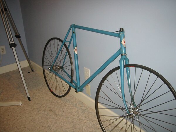
This thread is a bit dated, but I wanted to contribute as I have this same bicycle (though originally in "British racing green" but with the gold lug lining) and have not seen another since acquiring mine. If going by the dates on the headset and bottom bracket, it is from 1973. I had a framebuilder named Christopher Igleheart (known for his rigid MTB forks here in the States) make a few modifications - respacing the rear triangle to 126mm, crimping chainstays for fat tire clearance, moving bridges for fender clearance, cantilever posts spaced for 650b wheels, brake cable stops and water bottle mounts added.

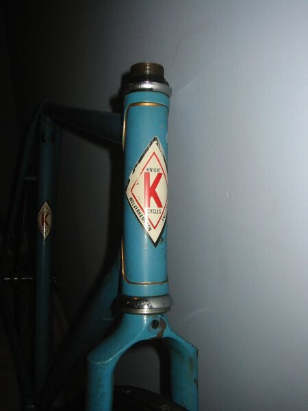
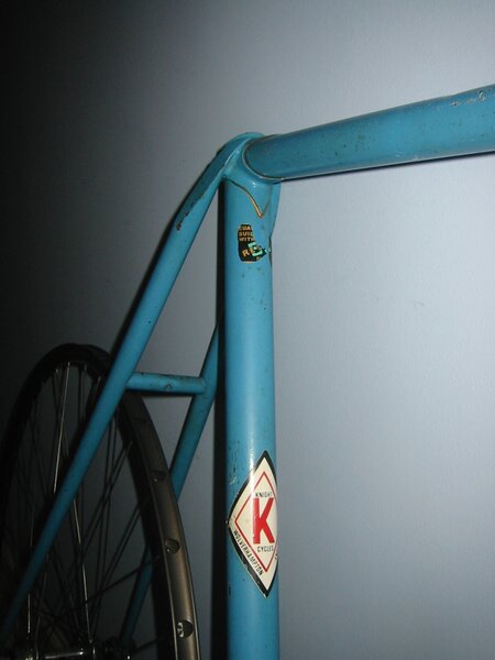
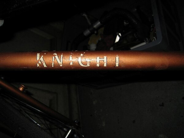
The downtube transfer is from H Lloyd, the original - a large oval thing - was a bit ghastly! It had the same diamond shaped head and seat tube transfers depicted in your photos plus a worn Reynolds 531 transfer near the seat lug. All restoration decals and paint by John Bowe of Underground Cycle, New Hampshire. John Bowe painted for Christopher Igleheart. He used to be Ted Wojcik's in-house painter before going solo. He currently paints for Boston framebuilder Peter Mooney.

The original components included a Campagnolo Record headset and bottom bracket, GB handlebar/stem, Weinmann calipers/levers, TTT seatpost and generic replacement saddle, TA Professionel crankset, Shimano Crane rear mech, Huret Jubilee front mech, Normandy Luxe Competition hubs laced to AVA clincher rims and a Maeda (SunTour) 5spd freewheel.

Replacement components included Grand Bois stem/handlebars/decaleur, Mafac cantilever brakes and levers, Brooks Pro saddle, TA Pro 5 Vis crankset, Huret Jubilee rear mech, Campagnolo record hubs laced to Velo Orange Diagonale rims, Honjo fenders, IRD 5spd freewheel.

This machine served as my primary randonneuring bicycle from 2012-2015. In that time it saw countless miles, completing many Brevets and weekly century and 200k rides. It is being restored with a mix of the aforementioned components and will be for sale in the coming months. Just thought I would share!


https://www.flickr.com/photos/noahspath ... ateposted/

https://drive.google.com/file/d/0B7zCz7 ... sp=sharing

https://drive.google.com/file/d/0B7zCz7 ... sp=sharing

https://drive.google.com/file/d/0B7zCz7 ... sp=sharing

https://drive.google.com/file/d/0B7zCz7 ... sp=sharing

https://drive.google.com/file/d/0B7zCz7 ... sp=sharing

https://drive.google.com/file/d/0B7zCz7 ... sp=sharing
 
A thread brought back from the dead.

Just like a lot of the bikes on here!

One of the main builders at Knight shared my family name - but I doubt very much if there's any connection.
 
Back
Top