Hi
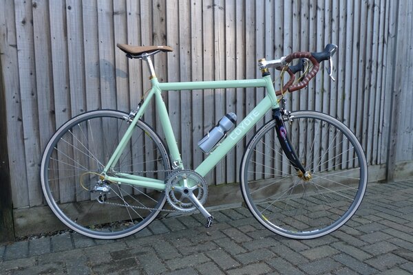
I built this bike because whilst I love the function of a modern bike, I love the look of an older bike. I am sick and tired of modern frames that are only available in Black, White or Red )or a combination of the three), and decent componentry that comes only comes in black and covered with garish decals. Utter madness. I like skinny tubed steel frames best, but until I can afford a new steel frame to hang all these components on, I made do with powder coating my old 7005 Coyote racing frame, but you get the gist..
Frame: Coyote ultralight
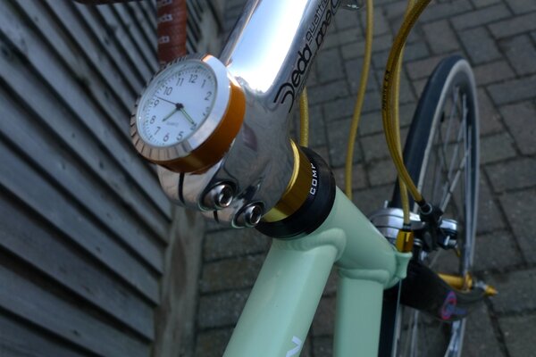
Fork: Dedaciai K force carbon
HEadset : Cheap M part
Saddle : charge Spoon (very comfy)
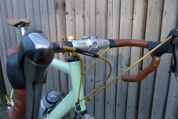
Bars : Ritchey anatomic (Still need to remove the rest of the DEDA logos of this "poo" brown tape)
Stem : Deda
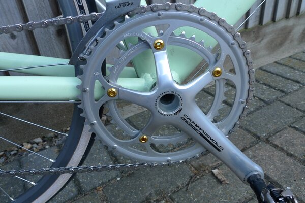
Chainset : Campag Centaur 39/53 (want to change the outer ring for cosmetic reasons)
Chain : SRAM
Cassette : 105 10 speed 12-25
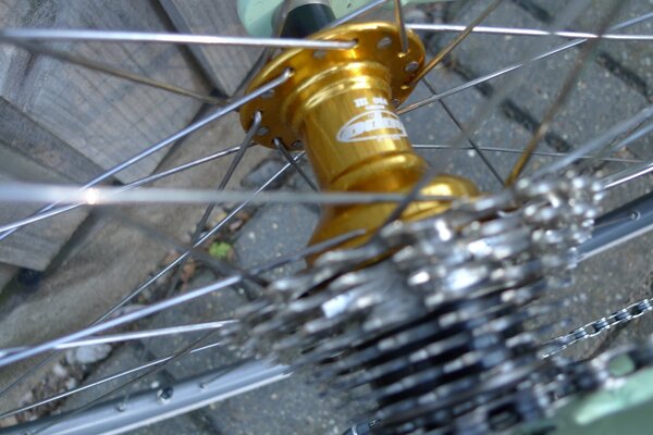
Hubs : Hope Pro 3 Mono (beautiful but boy, is that freewheel loud)
Rims : Mavic Open Pro CD (because I couldn't find MA40s at the time)
Tyres : Schwalbe Lugano (cheap and the sidewalls are gum coloured-ish, but they still don't look right)
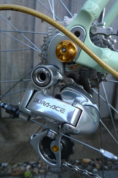
Rear mech : Dura Ace 7700
Front Mech : Ultegra
Brakes : Dura Ace 7800
Brifters : Dura Ace 7800
Cables : Jagwire Gold Medal
Bling :various gold bits, all topped off with a Stem Captain clock.
So what do you reckon? Unique Modern Retro? Did I succeed?
I built this bike because whilst I love the function of a modern bike, I love the look of an older bike. I am sick and tired of modern frames that are only available in Black, White or Red )or a combination of the three), and decent componentry that comes only comes in black and covered with garish decals. Utter madness. I like skinny tubed steel frames best, but until I can afford a new steel frame to hang all these components on, I made do with powder coating my old 7005 Coyote racing frame, but you get the gist..
Frame: Coyote ultralight
Fork: Dedaciai K force carbon
HEadset : Cheap M part
Saddle : charge Spoon (very comfy)
Bars : Ritchey anatomic (Still need to remove the rest of the DEDA logos of this "poo" brown tape)
Stem : Deda
Chainset : Campag Centaur 39/53 (want to change the outer ring for cosmetic reasons)
Chain : SRAM
Cassette : 105 10 speed 12-25
Hubs : Hope Pro 3 Mono (beautiful but boy, is that freewheel loud)
Rims : Mavic Open Pro CD (because I couldn't find MA40s at the time)
Tyres : Schwalbe Lugano (cheap and the sidewalls are gum coloured-ish, but they still don't look right)
Rear mech : Dura Ace 7700
Front Mech : Ultegra
Brakes : Dura Ace 7800
Brifters : Dura Ace 7800
Cables : Jagwire Gold Medal
Bling :various gold bits, all topped off with a Stem Captain clock.
So what do you reckon? Unique Modern Retro? Did I succeed?